
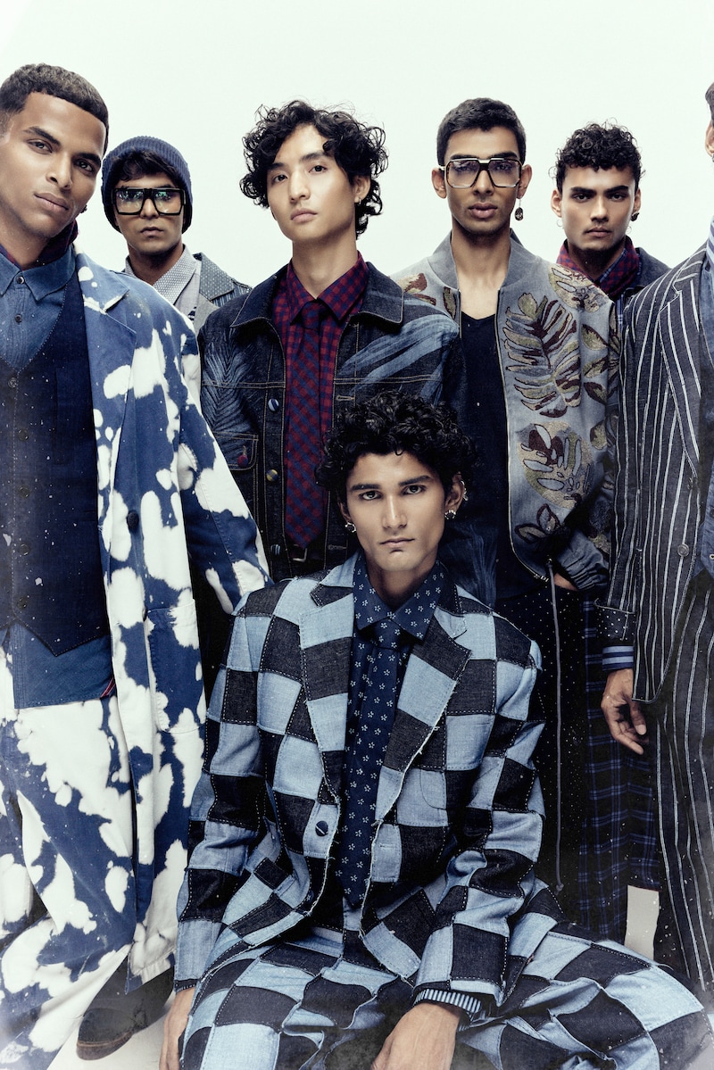
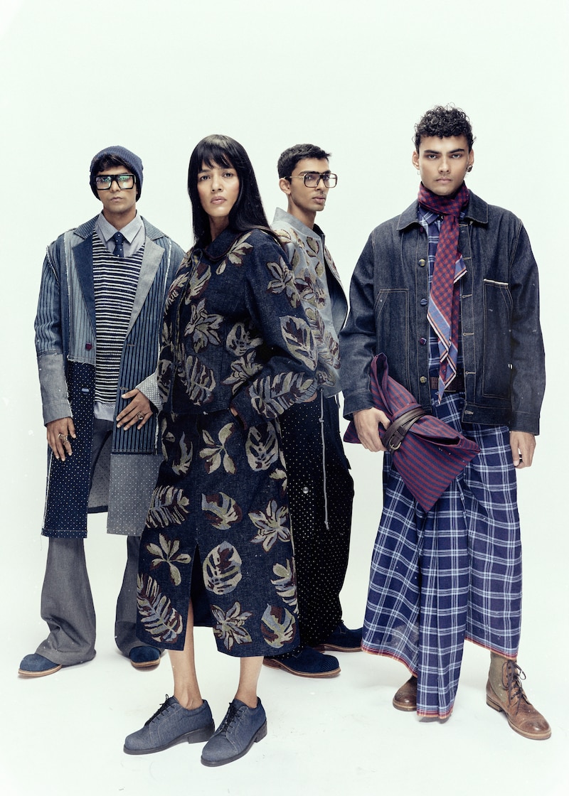
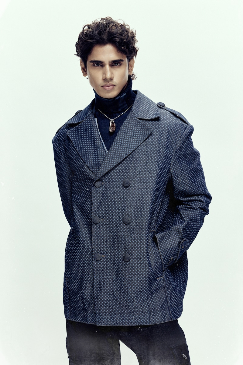
At Lakmē Fashion Week this season, Payal Pratap presented Memories Pressed in Time, created in collaboration with R|Elan, marking several firsts for the designer. It was her first showing in Mumbai, her first time working with denim as a primary fabric, and also her first menswear collection.
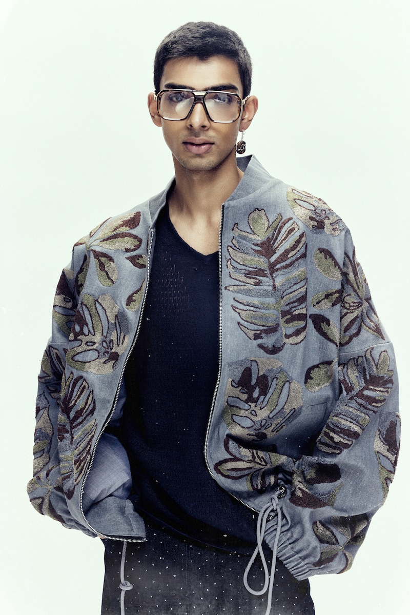
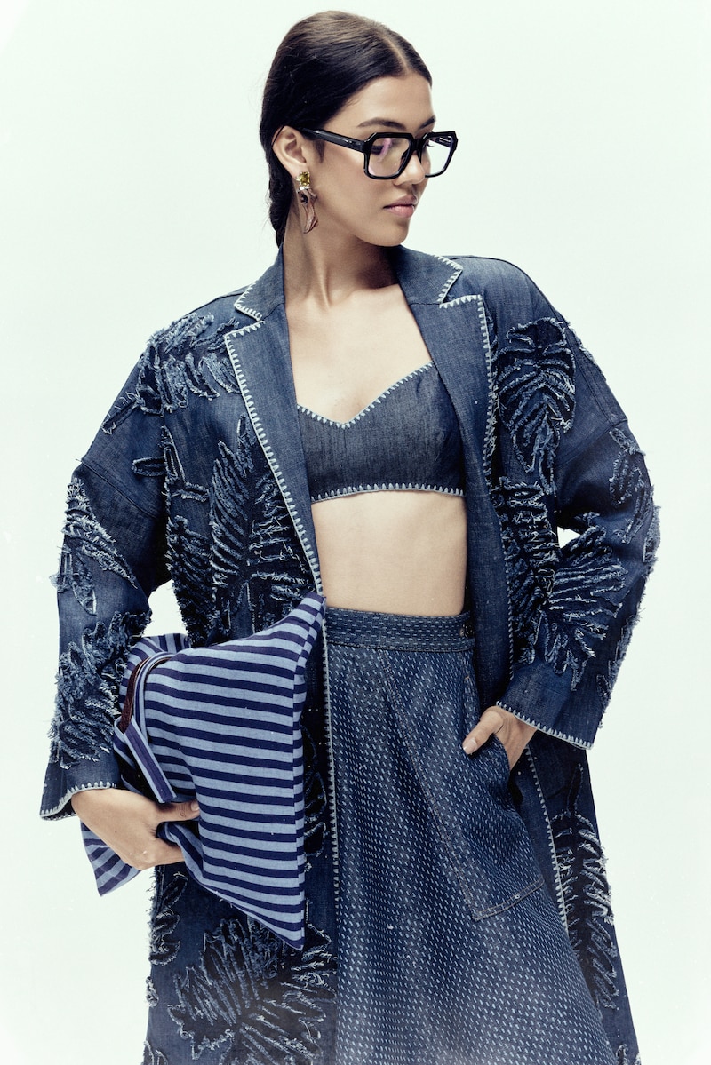
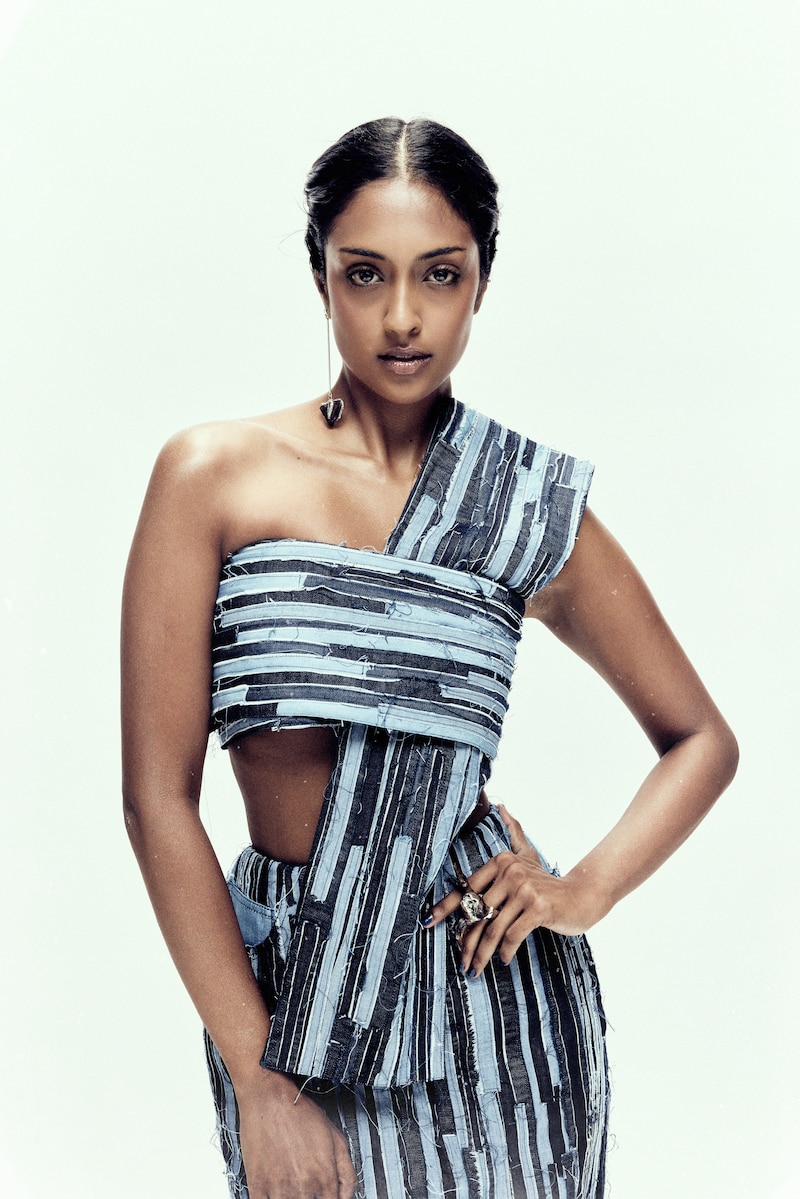
And yet, the collection felt true to the language Payal Pratap is known for. Through pressed botanicals, faded textures and layered surfaces, the collection explored the idea of memory and how it stays with us over time. Ferns, leaves and flowers from the designer’s own garden appeared across denim through cyanotype, embroidery, patchwork and washes. The garments felt worn in as if they had lived a life before reaching the runway.
In conversation with First Look, Payal spoke about memory, denim, menswear and how the language of her label continues to evolve while staying true to itself.
FL: How did it feel showcasing your first menswear collection in Mumbai?
PPS: It felt like a quiet turning point. Mumbai has a certain immediacy to it, everything feels more visible, more heightened, so introducing menswear there felt quite exciting and new. At the same time, the silhouettes had been moving in that direction for a while, so presenting them in that context felt more like an acknowledgement than a departure.
FL: Denim is a first for the label. What drew you to this material, and how did you make it your own?
PPS: What drew me to denim was its ability to hold time. It’s a fabric that doesn’t remain static, it fades, softens and takes on the life of the wearer. That sense of evolution felt very compelling. To make it my own, I approached it less as a category and more as a surface. I brought in processes like embroidery, patchwork and washing to soften it, to give it nuance. The idea was to move it away from something purely functional into something more layered and expressive.
FL: The collection explores memory through botanicals. How did you translate something so ephemeral into a lasting textile language?
PPS: I wasn’t trying to preserve the exact image of a botanical, but rather the feeling of it, the idea of something being held or remembered. Cyanotype became important because it naturally creates an imprint, almost like a shadow of something that once existed. Combined with layers of craft, it allowed the fabric to feel built over time, rather than fixed or decorative.
FL: There’s a deeply personal undertone to the collection. How do you navigate translating something so intimate into something universal?
PPS: I think honesty is what allows something to travel. When the starting point is personal and specific, it tends to resonate in a more genuine way. I don’t consciously try to universalise it. Once the garment exists, it begins to belong to the person wearing it. Their movement, their experience, their memory, that’s what completes it.
FL: Looking at the collection as a whole, how do you see it expanding or redefining the language of your label?
PPS: It feels like a shift in material, but not in philosophy. The core of the label, craft, ease, a certain quietness, remains the same. What denim introduced was a different kind of structure and resistance, and that pushed the work into a new space. It allowed the language to stretch, but still stay rooted in what defines it.
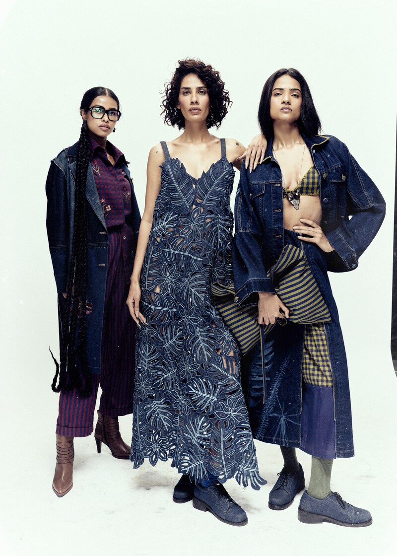
With Memories Pressed in Time, Payal Pratap did not simply introduce denim or menswear into the label’s world. She expanded it gently. The collection stayed close to nature, craft and memory while exploring a new material language. Nothing felt forced, and probably that is what made it feel so honest. The clothes carried softness, time and familiarity, just like something remembered long after the season ends.


